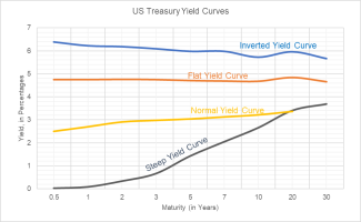
Shapes of the Yield Curve
A yield curve is a graph or plot of interest rates that buyers of government debt demand to lend their money over various periods of time. A yield curve shows the difference in interest rates along the vertical axis and maturities (time) along the horizontal axis. The curve which most investors refer to as “the yield curve” reflects the short (4, 8, 13, 26 and 52-week bills), intermediate (2, 3, 5, 7 and 10-year notes) and long term (20 and 30-year bonds) interest rates of US Treasuries. The yield curve is a par yield curve which means that each point on the curve gives a bond’s coupon, which is its yield, and that bond’s price, which is par. The Treasury yield curve is often considered a proxy for investor sentiment and can be used by investors to help gauge the direction of the economy. The factors that can influence changes in the yield curve differ on either end. Short-term interest rates (the short end of the curve) are typically influenced by expectations of domestic monetary policy and more specifically the stance of the Federal Reserve on the federal funds rate, which is the rate at which banks can borrow cash reserves on an overnight basis. Short-term rates will often rise when the Fed is expected to raise rates and fall when it is expected to cut rates. The long end of the yield curve is influenced more by economic growth predictions, inflation and investor sentiment.
The shape of the Treasury yield curve has long been a reliable indicator of the current and future strength of the US economy. There are three main types of yield curve shapes: normal, flat and inverted. A normal curve slopes upward from left to right on the graph as maturities lengthen and yields rise. This makes sense. If you are a lender, you would expect to be rewarded for the increased risk you would assume in making a long-term loan commitment versus a shorter one. A flat yield curve is often called a yield curve in transition and occurs when short-term rates rise to the point in which they are close to long-term rates (or when long term rates fall more than short term rates). History suggests that while a flattening yield curve does not by itself reduce growth expectations it nonetheless often leads to an economic slowdown and lower interest rates. An inverted yield curve occurs when short-term rates have risen above the long-run natural rate of interest. An inverted or downward sloping curve suggests yields on longer-term bonds may continue to fall, corresponding to periods of significant economic slowdown or recession usually within one year of the inversion.
So, what is the yield curve telling us now? It is no surprise that the ongoing pandemic has had significant impact on the shape of the yield curve over the last 2 years. It is interesting to note that the most recent yield curve inversion occurred in 2019, suggesting an economic slowdown or recession in 2020. A recession did occur, but not the type predicted as the Covid pandemic forced a shutdown of much of the global economy in the spring of 2020. In 2021, the yield curve presented a normal, upward slope that steepened throughout the year as the economy reopened, growth surged and Fed monetary policy remained very accommodative. Here in 2022, the yield curve has started to flatten – remember, the curve is influenced as much by expectations as it is by conditions. With the Fed’s plan to raise rates in 2022 (4 to 5 hikes of 25 bps are expected) the curve will continue to flatten perhaps signaling that the current post-Covid expansion could be much shorter in duration. The flattening in this case is, of course, the result of short term rates increasing more than long term rates. The flattening of the curve can become a recessionary signal if it continues to inversion. In a contrarian view, some investors believe that the latest flattening (and fear of an inversion) may force the Fed to alter its aggressive tightening plans later this year.

